

Defeating drug
addiction one
person at a time!
addiction one
person at a time!
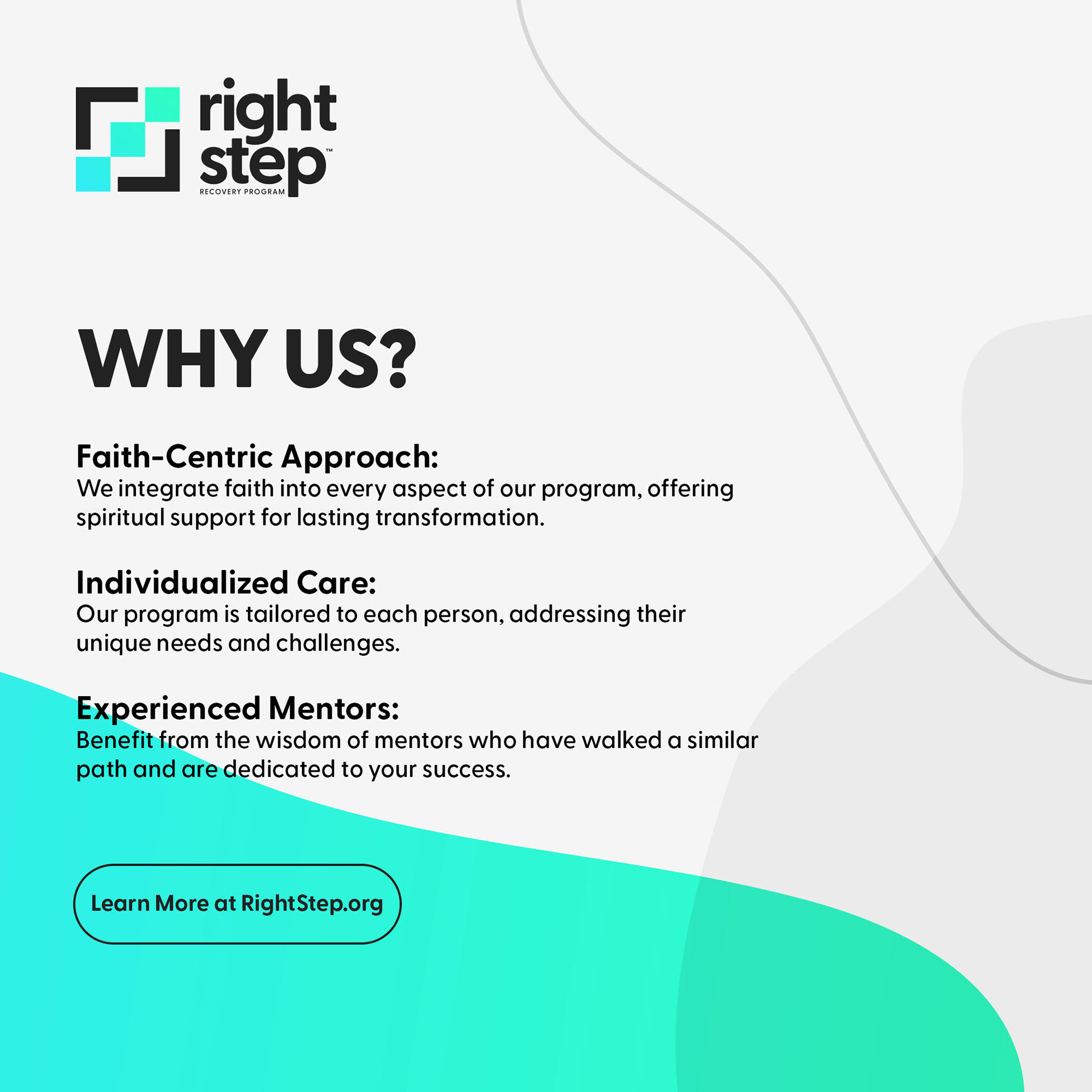
The Right Step is a non-profit organization devoted to assisting individuals in overcoming substance misuse and addiction through a biblical approach that includes therapy and mentorship. The program seeks to address not just the immediate issues of addiction, but also to empower individuals to create a secure and meaningful future.
the challenge
Rebrand the company with a new visual identity
that represents and embodies the organization
core values.
that represents and embodies the organization
core values.
deliverables
#Web Design #Visual Identity #MarketingCollateral
#Web Design #Visual Identity #MarketingCollateral
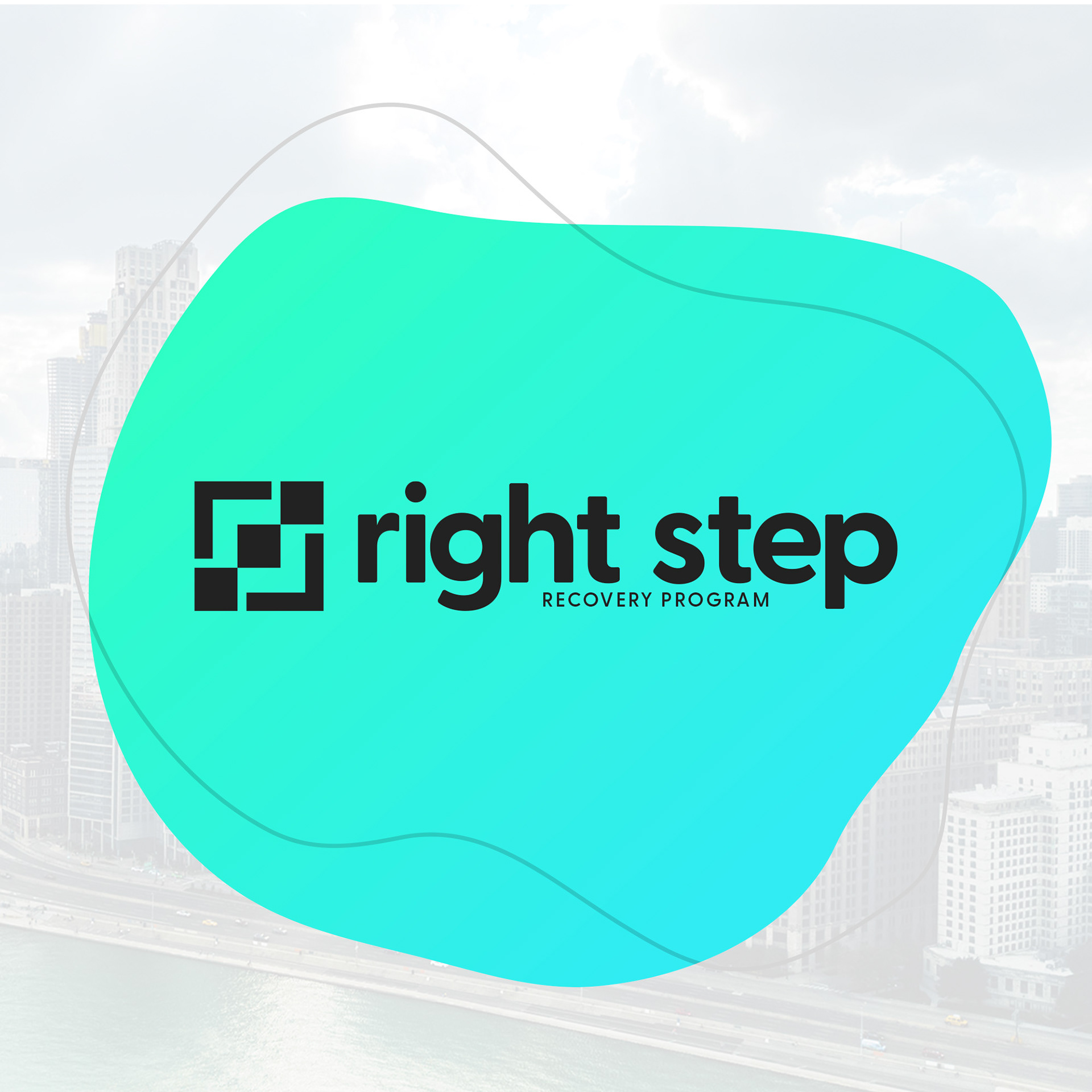
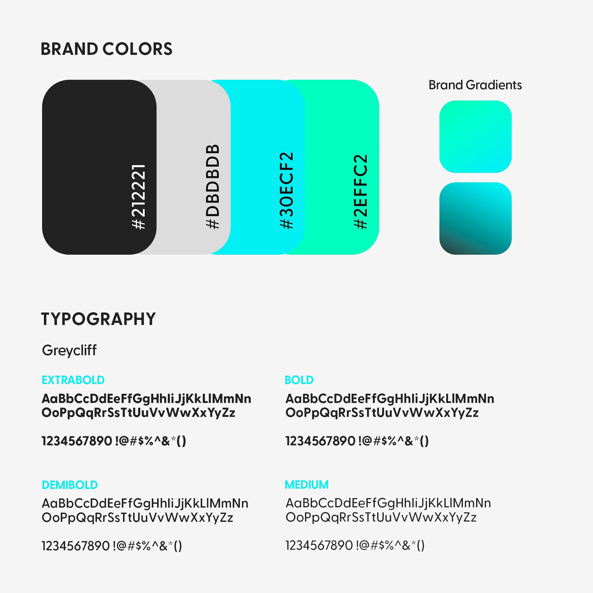
visual identity
The visual identity consists of the logo usage, typography, and brand color palette. These elements communicate the ideals of the organization.
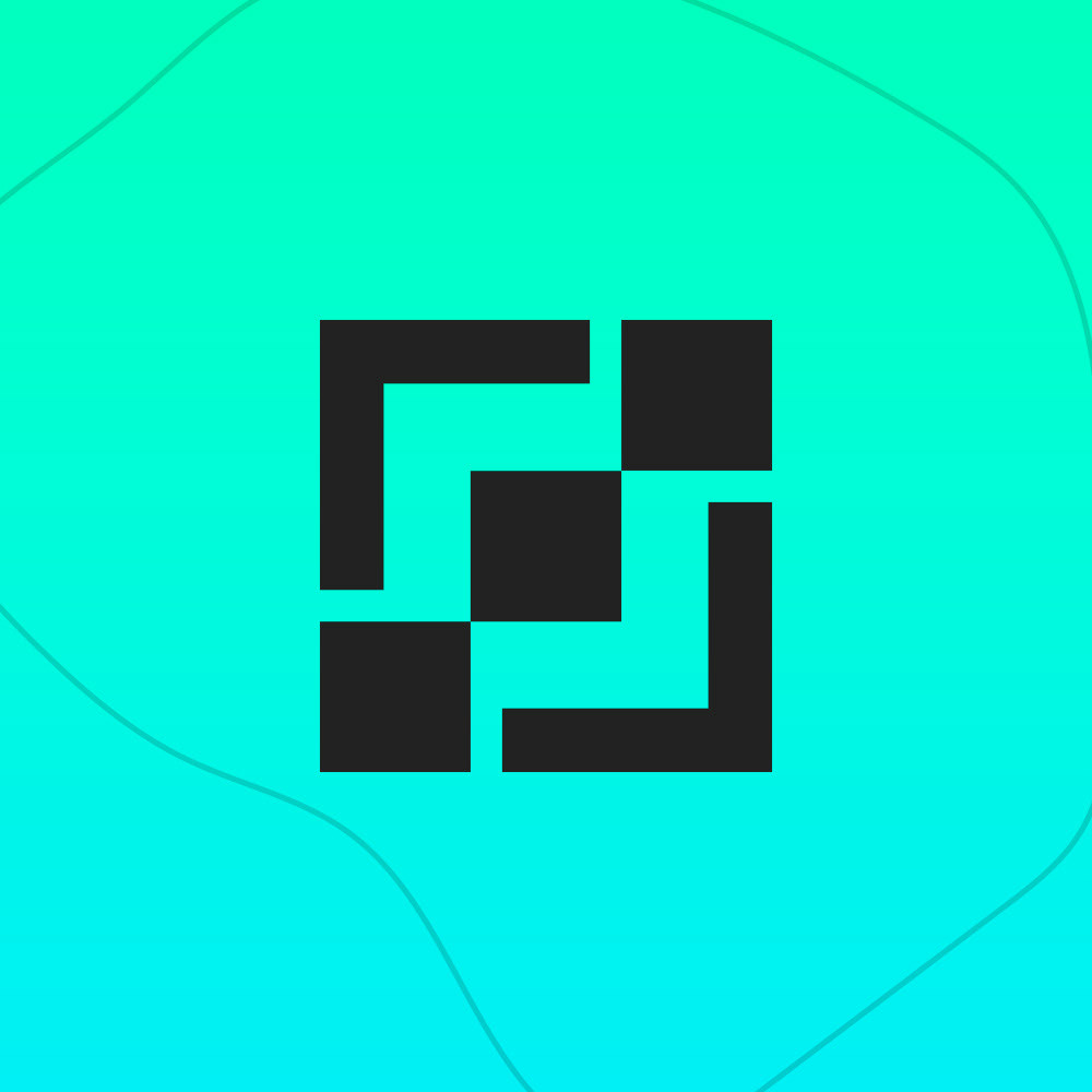
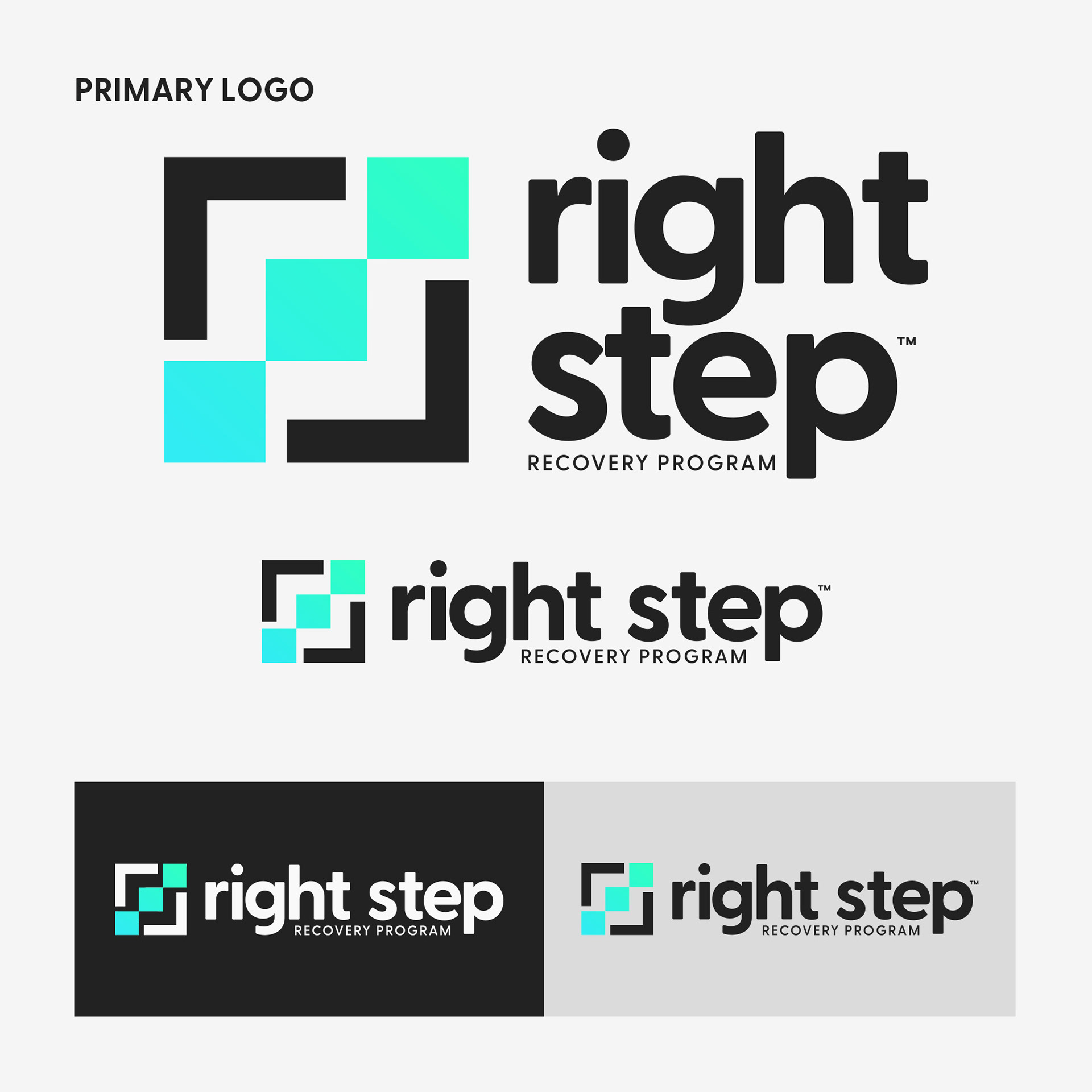
Logo
The logo represents the core values of the organization. The three-color blocks signify the Father, the Son, and the Holy Spirit. The outside brackets symbolizes that the Father, Son, and Holy Spirit should be at the heart of each person.
Colors
The Right Step brand colors represent the freedom that comes from overcoming addiction. The colors we picked have an important role in distinction and brand awareness.
Typography
We modified the brand's typography to make it more current and clean. A typeface that may be used on both big printed displays and small digital devices.

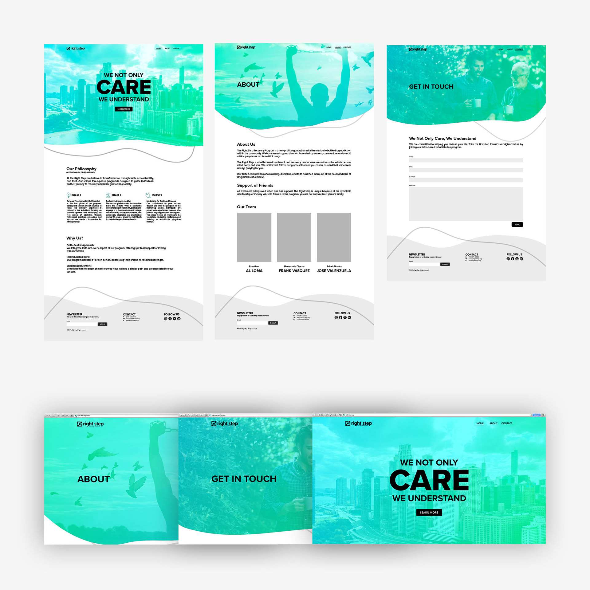
design system
The design system aims to improve the brand, engage the target audience, and create a lasting impression. The typography, shapes, gradients and color palettes were chosen to enhance the visual identity.
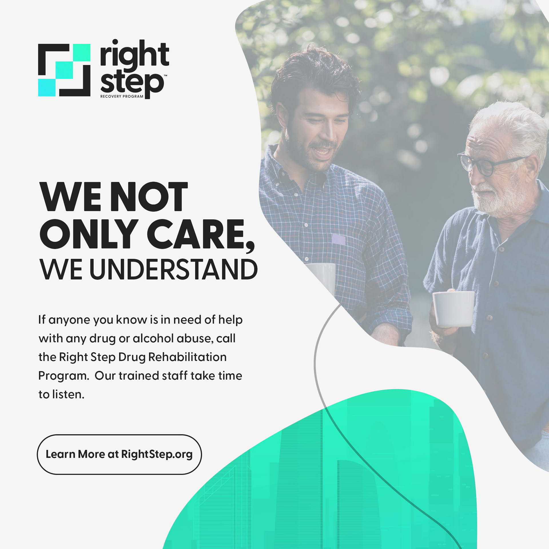
Print Collateral
The client required a uniform and cohesive design for all print material needs. We created new letterheads, envelopes, and stationery to reflect the client's brand.
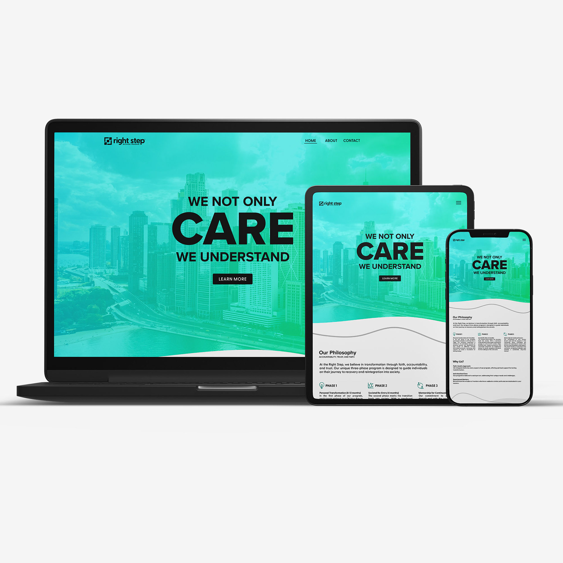
Digital Design
We live in a digital age, thus site design, user interface (UI), user experience (UX), and digital content production were essential for the client's growth.


ready to transform your brand?
Let's bring your vision to reality. Contact us today to discuss how our design expertise can elevate your business.